Introduction
In today’s competitive business landscape, understanding your customers is key to driving growth and success. The Customer Analysis Project aims to uncover valuable insights about customer behavior, revenue trends, and regional performance using data-driven techniques. By leveraging data preparation, analysis, and visualization, the project transforms raw data into actionable insights that empower businesses to make informed decisions.
Whether you are a beginner learning about data analysis or an expert in the field, this project provides a structured, step-by-step approach to extracting insights from customer data. It also culminates in an interactive dashboard built using Tableau Public, making it easy to explore data and gain key takeaways.
Step 1: Preparing the Data
The dataset consisted of over 26,000 records with important fields such as:
- Region: Geographic regions where sales were recorded (e.g., Northeast, South).
- State: Specific states within the regions.
- Age and Age bins: Numerical age values and groupings (e.g., 30–40, 40–50).
- Category: Classifications of customers or products.
- Total: Sales or revenue figures.
Data Preparation Process:
Data Cleaning:
- Checked for and removed duplicate rows.
- Handled missing or null values.
- Standardized text fields like Region and State for consistency (e.g., fixing typos).
Data Transformation:
- Grouped the data into meaningful categories (e.g., age groups and states).
- Created aggregated metrics such as total revenue per region and average sales per age group to simplify the analysis.
Data Validation:
- Ensured all totals and aggregated values aligned with expectations.
- Checked for anomalies or outliers in revenue data.
This step ensured the data was clean, organized, and ready for analysis.
Step 2: Analyzing the Data
The data analysis was broken into six key focus areas to answer important business questions:
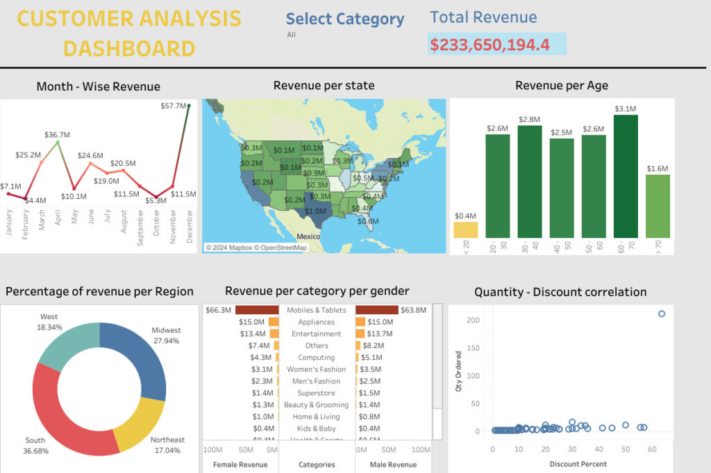
Month-Wise Revenue:
- Revenue was analyzed across different months to identify seasonal trends.
- This analysis helps businesses understand which months perform best and plan marketing campaigns or inventory accordingly.
Revenue Per State:
- Aggregated revenue was calculated for each State to highlight high-performing areas.
- For example, states like Pennsylvania (PA) and Massachusetts (MA) emerged as top contributors to total sales.
Revenue Per Age Group:
- Customers were grouped into age bins (e.g., 30–40, 40–50).
- Age groups such as 30–40 and 40–50 were identified as significant contributors to total revenue.
- This insight is valuable for tailoring products or marketing campaigns to specific demographics.
Percentage of Revenue Per Region:
- The contribution of each Region to the overall revenue was calculated as a percentage.
- The Northeast region contributed the largest share, highlighting its importance to business growth.
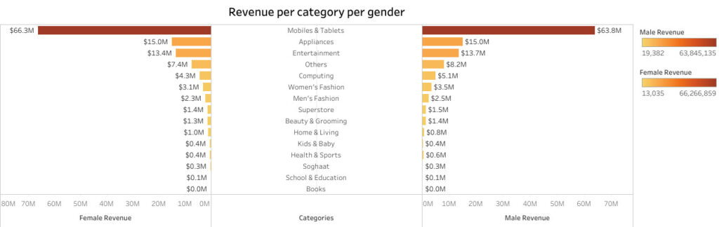
Revenue Per Category Per Gender:
- Revenue data was segmented by Category and Gender to understand customer preferences.
- For example, certain categories showed higher spending among male customers, while others were more popular among female customers.
Quantity-Discount Correlation:
- A correlation analysis was conducted to identify the relationship between quantity sold and discounts offered.
- The results showed that higher discounts often led to increased sales quantities, indicating that discount strategies are effective in driving sales.
Each of these analyses provided a unique perspective on customer behavior, revenue patterns, and opportunities for improvement.
Step 3: Creating the Dashboard
To make the analysis accessible and interactive, a Customer Analysis Dashboard was created using Tableau Public. The dashboard combines all the insights into a single platform for easy exploration.
Steps to Create the Dashboard:
Connecting the Data:
- The cleaned dataset was imported into Tableau Public.
Building Visualizations:
- Line Chart: Visualized month-wise revenue trends to highlight seasonal performance.
- Bar Charts: Displayed state-level and regional revenue.
- Pie Chart: Showed the percentage contribution of each region to overall revenue.
- Stacked Bar Chart: Analyzed revenue by category and gender.
- Scatter Plot: Displayed the correlation between discounts and quantity sold.
Designing the Dashboard:
- All visualizations were combined into a clear, user-friendly layout.
- Filters were added for Region, State, and Age group, allowing users to explore the data dynamically.
- Tooltips were customized to display exact values on hover for better clarity.
Publishing:
- The dashboard was published on Tableau Public, making it accessible to stakeholders and viewers.
Step 4: Interpretation of Results
The final dashboard provided actionable insights, which can be summarized as follows:
Revenue Trends Over Time:
- Certain months showed peak revenue, suggesting that businesses should focus promotions and campaigns during these high-demand periods.
State-Level Performance:
- Top-performing states like Pennsylvania (PA) and Massachusetts (MA) contributed significantly to revenue.
Age Group Insights:
- Customers in the 30–40 and 40–50 age bins drove the majority of revenue, making them a priority for targeted marketing efforts.
Regional Contributions:
- The Northeast region dominated revenue contributions, while other regions showed growth opportunities.
Category and Gender Analysis:
- Clear preferences emerged between male and female customers across different categories, allowing for tailored product and marketing strategies.
Discount Effectiveness:
- A positive correlation was found between quantity sold and discounts offered, highlighting the importance of discounts in boosting sales. However, businesses must carefully balance discounts to ensure profitability.
Conclusion
The Customer Analysis Project demonstrates the power of turning raw data into actionable insights. By analyzing trends in revenue, customer demographics, and regional performance, businesses can:
- Focus efforts on top-performing regions and states.
- Target high-value customer groups (e.g., 30–50 age range).
- Optimize promotional strategies based on seasonal trends.
- Leverage discount strategies to boost sales while maintaining profitability.
The Customer Analysis Dashboard, built with Tableau Public, provides an interactive and user-friendly way to explore these insights. Whether you are a beginner learning the ropes of data analysis or an expert seeking a structured project, this workflow shows how to derive business value through data-driven decisions.

Latest blog
Follow me on